Feature update for crypto news app
Project summary
Newsbit is a cryptocurrency news app. This update was about making the news accessible — and it added price alerts for the coins users follow.
My part:
- A price-alert system: pick a coin, set a target, get notified.
- A restyle of the news articles, including the empty states.
- Onboarding illustrations that fit the app’s existing look.
- A dark mode, built on the existing color system.
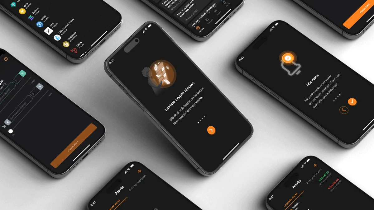
The update that shipped
Four features added to a live app without breaking its look:
Alerts without the noise
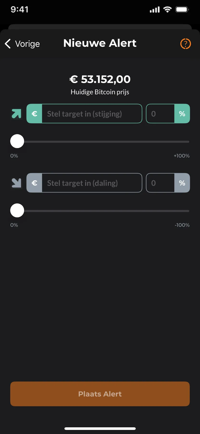
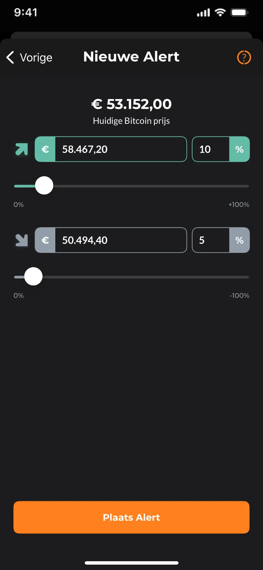
Holders don’t want a feed of everything — they want to know when their coin moves. The flow keeps it to three decisions:
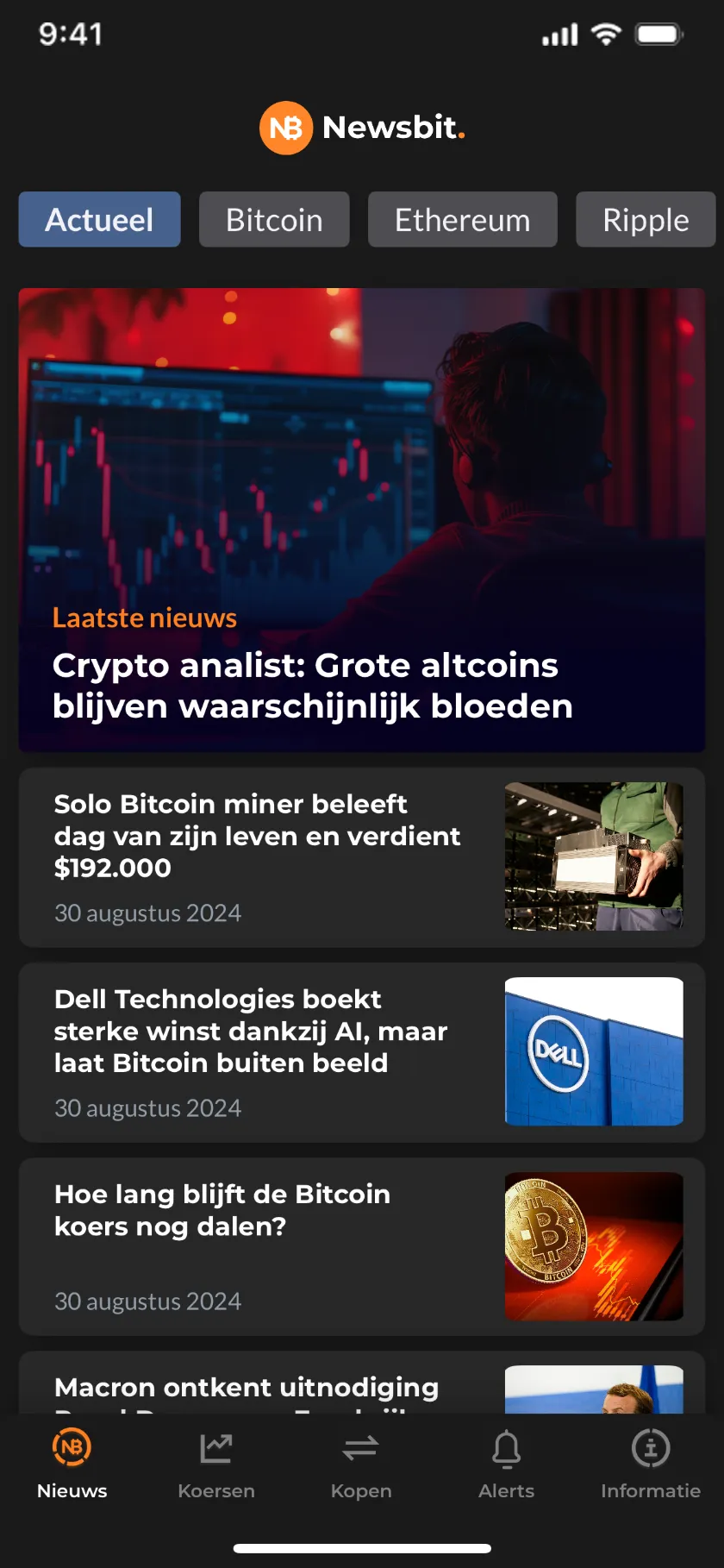
One feed, two modes
Dark mode complements the existing color scheme rather than replacing it — checked with contrast tools so both modes read equally well at a glance.

Feature benchmarking
Looked at how competing platforms handle alerts, articles and dark mode to see what worked and what to avoid.
Stakeholder management
I kept stakeholders in the loop and aligned on decisions from kickoff to delivery.
Wireframing and prototyping
Created wireframes and interactive prototypes to map out the user needs and test functionality, improving the design over several rounds of testing.
Dark mode handling
I used contrast checkers and some color theory to keep the dark theme readable and accessible.
What I delivered
Wireframes & prototype
Mapped and tested in Sketch before any final UI was drawn.
Alert system
Coin picker, targets by amount or percentage, and a manage list.
Article redesign
A cleaner reading experience for the news feed.
Empty states
Every empty area tells the reader what to do next.
Onboarding illustrations
Four illustrated steps, drawn in Illustrator.
Dark mode
Contrast-checked against the existing color system.

The approach
{{ a.title }}
{{ a.body }}
The screens
ONBOARDING → ALERTS → DARK MODE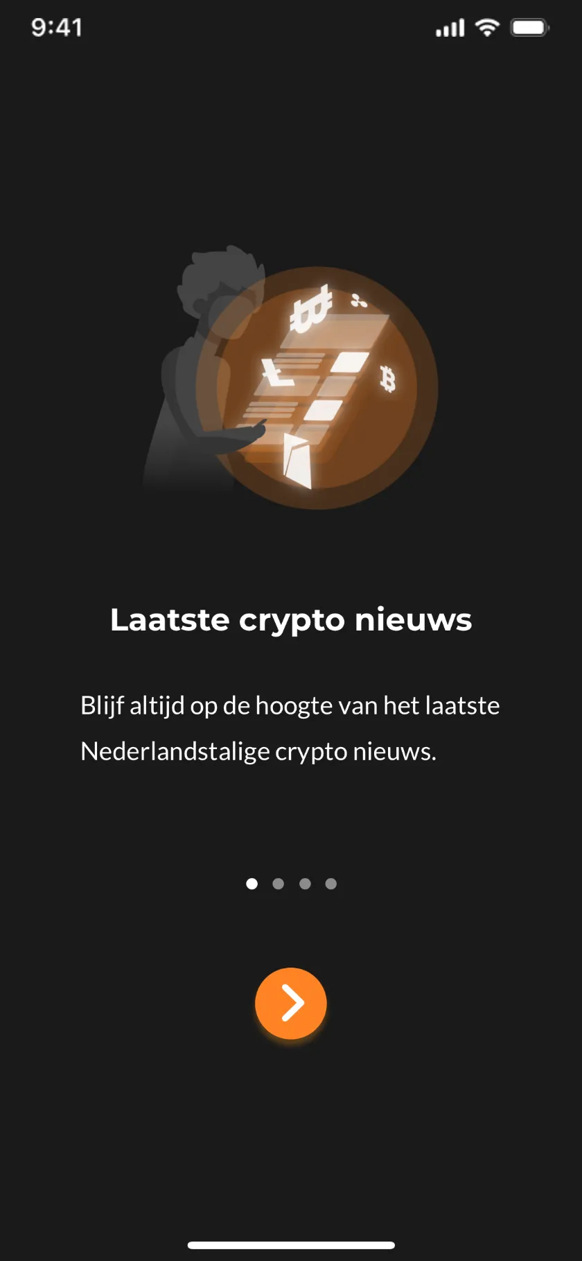
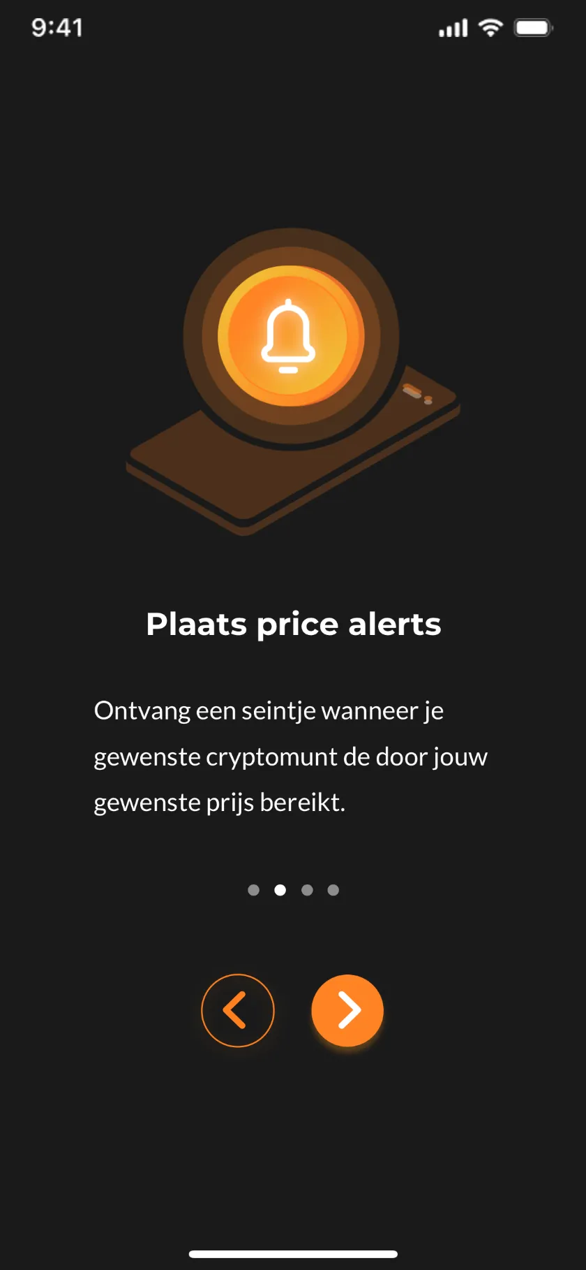
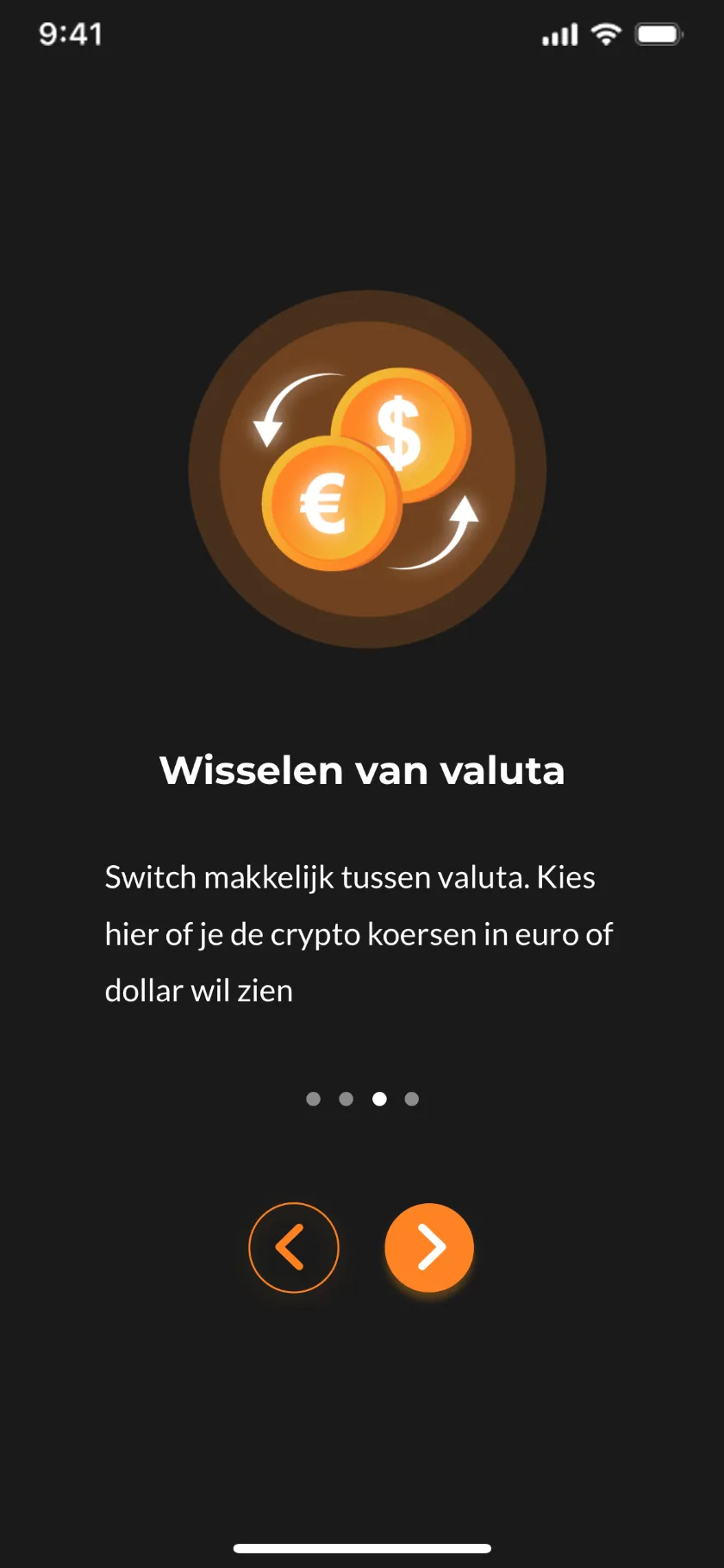
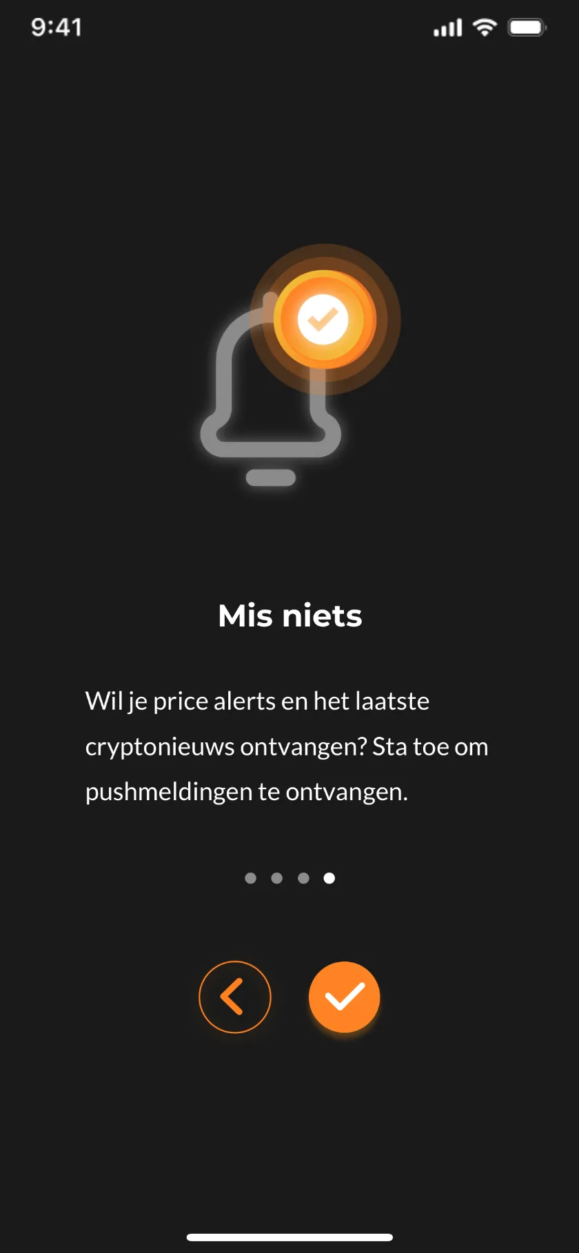
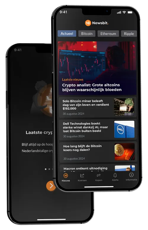
Four steps introduce the news feed, price alerts, currency switching and push notifications — each with an illustration drawn for the app’s existing visual language.
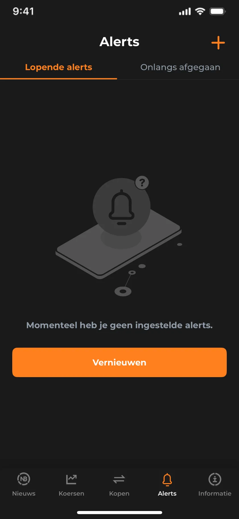 01 EMPTY
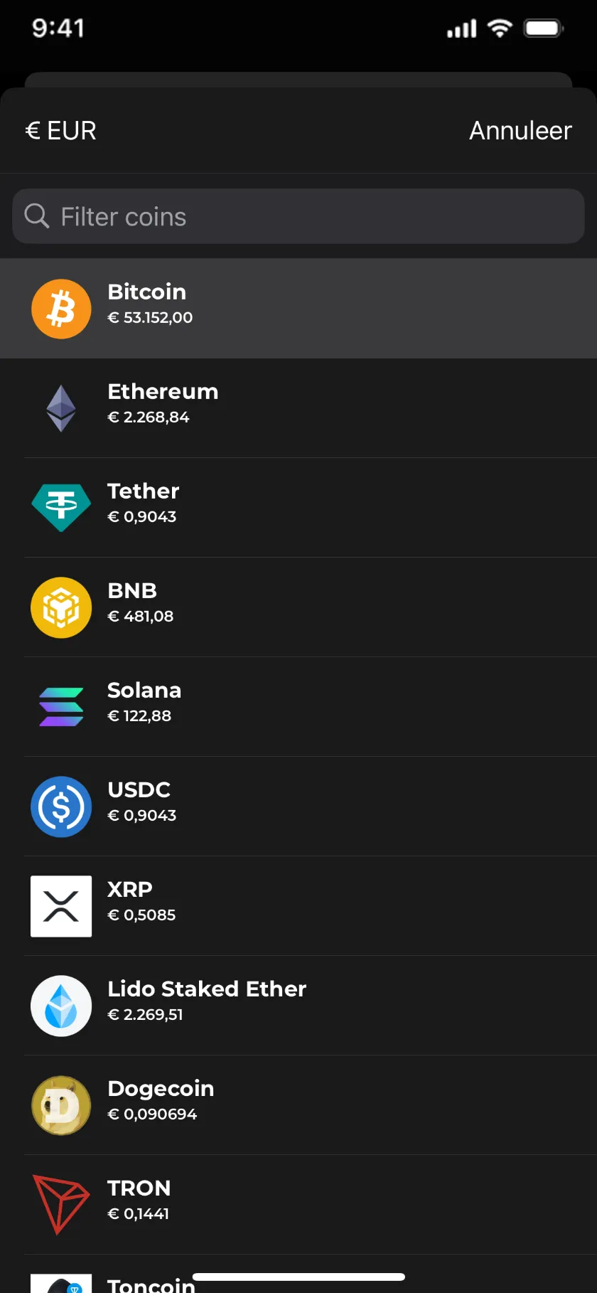 02 PICK COIN03 SET TARGET04 VALID
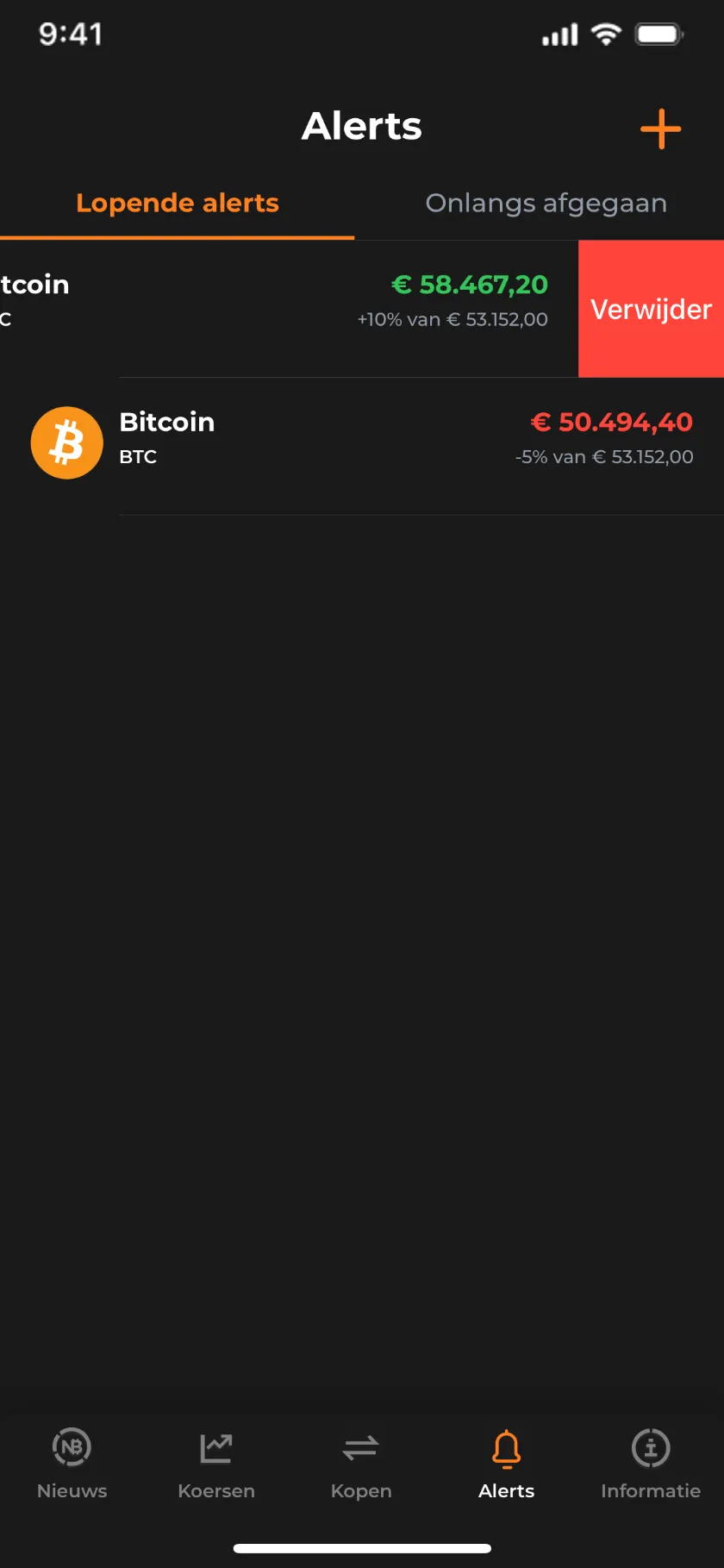 05 MANAGE
Users pick a coin, then set an upper and lower target by amount or percentage — value and slider stay in sync. The primary action stays disabled until a target is valid, and alerts are removed with a swipe.
The same feed in both modes. Dark mode keeps the existing accent colors and was checked with contrast tools, so nothing becomes harder to read after sunset.
Brand profile
Newsbit wants to be a go-to source for crypto news: timely, accurate and easy to read. The design work followed those values — a straightforward interface that gets people to the news fast.
Looking back
Three weeks is quick for four features. Given more time, the alert flow would have gone through usability sessions with people who actually hold coins — target-setting is exactly the kind of step where real users surprise you.
Working inside the existing design system paid off: the update reads as part of the app, not as a patch on top of it.