EV charging made effortless
Project summary
The Charge Assist project had a clear brief with real constraints: build a simple, user-friendly platform that makes electric vehicle (EV) charging as effortless as possible.
They needed a solution that would integrate multiple payment methods, support various charging networks, and provide a straightforward experience for users in a hurry. The challenge was to design an intuitive platform that not only met these technical requirements but also encouraged the adoption of EVs by making the charging process less intimidating and more accessible.
As the design of Charge Assist was in its infancy, a whole design system was developed with Atomic design principles and color tokens.
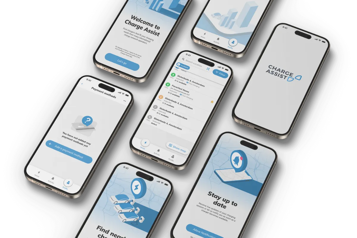
The app that shipped
Charge Assist launched on the App Store and Google Play with an interface designed end to end — wireframes, prototype and final UI, all built from the design system above.


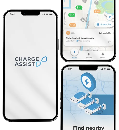
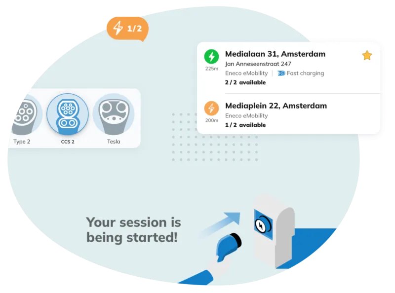
Flows for a driver in a hurry
The core journey — find a charger, check it, start the session — leans on decisions documented across this page:
An illustration language, not just screens
The isometric artwork was drawn in Illustrator and carried through onboarding, the app stores and the marketing site — one visual voice from the first launch screen to the landing page.
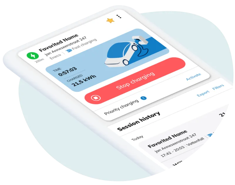
Discovery & benchmarking
Looked at the market and the competing charging apps to see what worked and where they fell short. Those findings shaped the design decisions.
User research & persona development
Developed detailed user personas representing different types of EV drivers. These personas guided design decisions.
Wireframing and prototyping
Created wireframes and interactive prototypes to map out the user journey and test functionality. These tools facilitated iterative design improvements and user feedback integration.
Design system creation
Built a design system covering colors, type and components, so screens stay consistent and new ones come together quickly.
What I delivered
Wireframes & prototype
Mapped and tested in Sketch before any final UI was drawn.
Final UI
Every screen of the shipped app, from splash to session history.
Design system
Atomic components and colour tokens, ready for engineering.
Isometric artwork
Vector illustration set drawn in Illustrator.
Accessibility
A status system tested for colour blindness.
Launch visuals
Artwork carried into the stores and the marketing site.


The approach
{{ a.title }}
{{ a.body }}
The design system
TOKENS → COMPONENTS → SCREENSAa Bb Cc Dd Ee Ff Gg Hh Ii Jj Kk Ll Mm Nn Oo Pp Qq Rr Ss Tt Uu Vv Ww Xx Yy Zz
1234567890()@#$%^&* .,;’
Mulish carries every screen of Charge Assist. A minimalist sans with open counters and a soft, humanist skeleton, it stays readable at arm’s length on a dash-mounted phone, and its soft tone takes the edge off a technical product. Two weights do most of the work — Bold for titles and actions, Regular for body and meta.
The same block of the map, seen three ways. The greens and ambers converge under each simulation — which is why no state relies on colour alone: the connector count and the crossed-bolt glyph carry the same information for every driver.

The loading state, animated in After Effects — a two-second logo build that turns wait time into brand and makes the app feel premium from the first tap.
 01 SPLASH
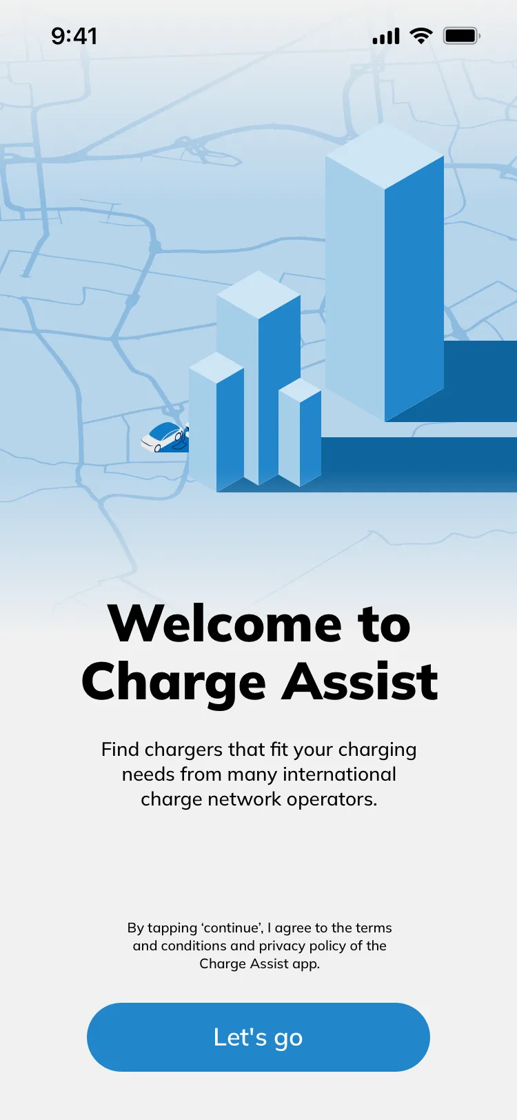 02 WELCOME
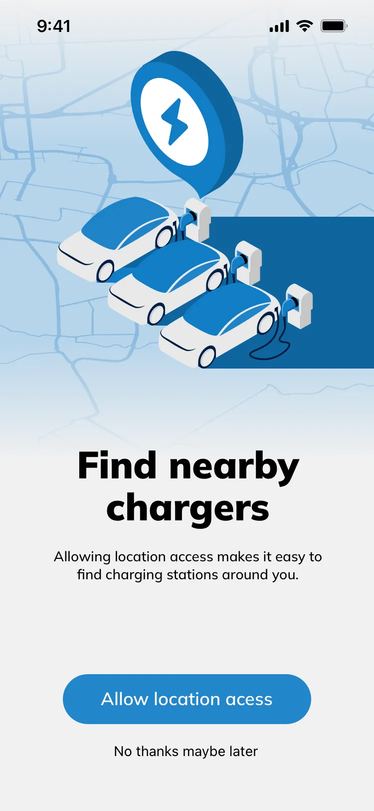 03 LOCATION
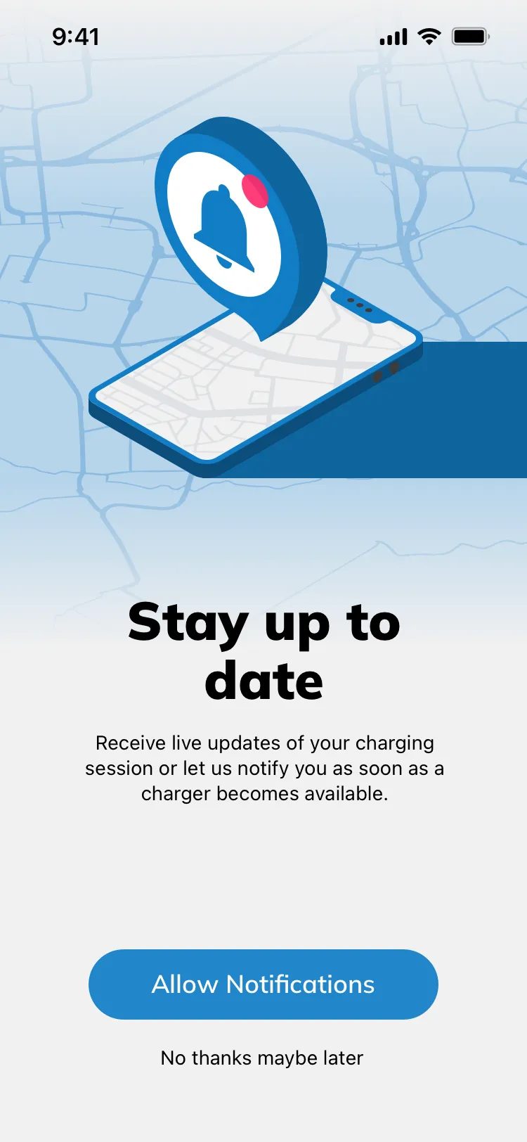 04 NOTIFICATIONS
Each permission is asked in context and earns its ask with an isometric illustration and a plain sentence — and every one can be skipped with “no thanks maybe later”.
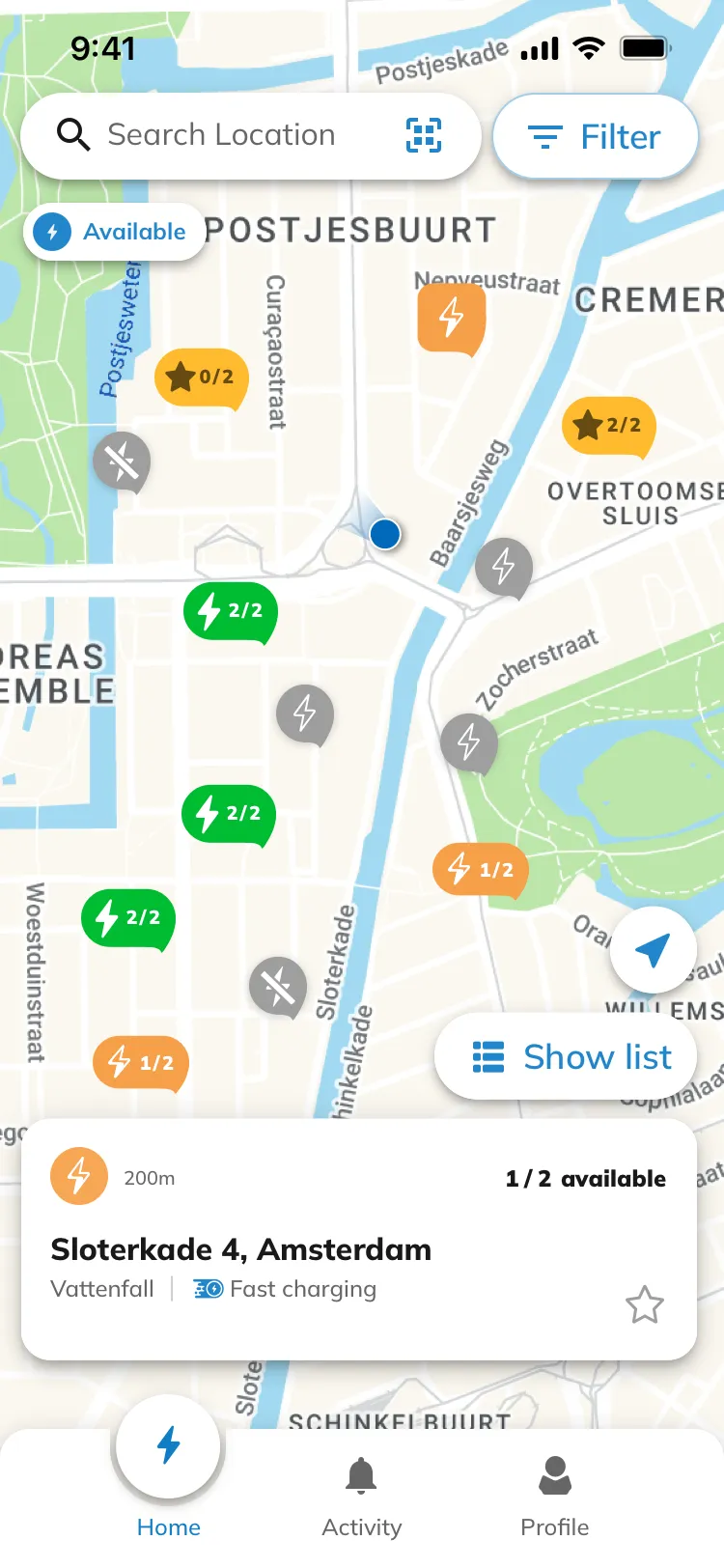 MAP
MAP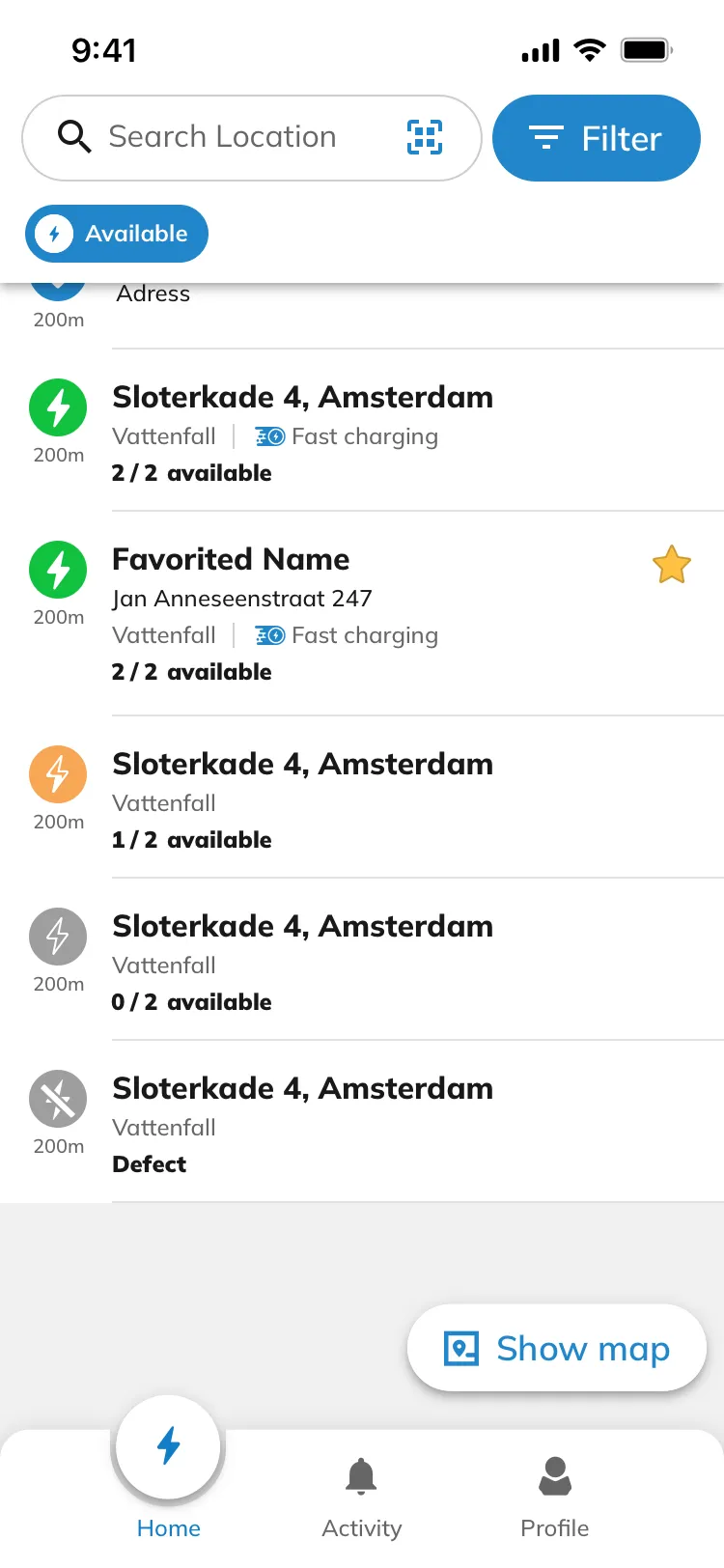 LIST
LIST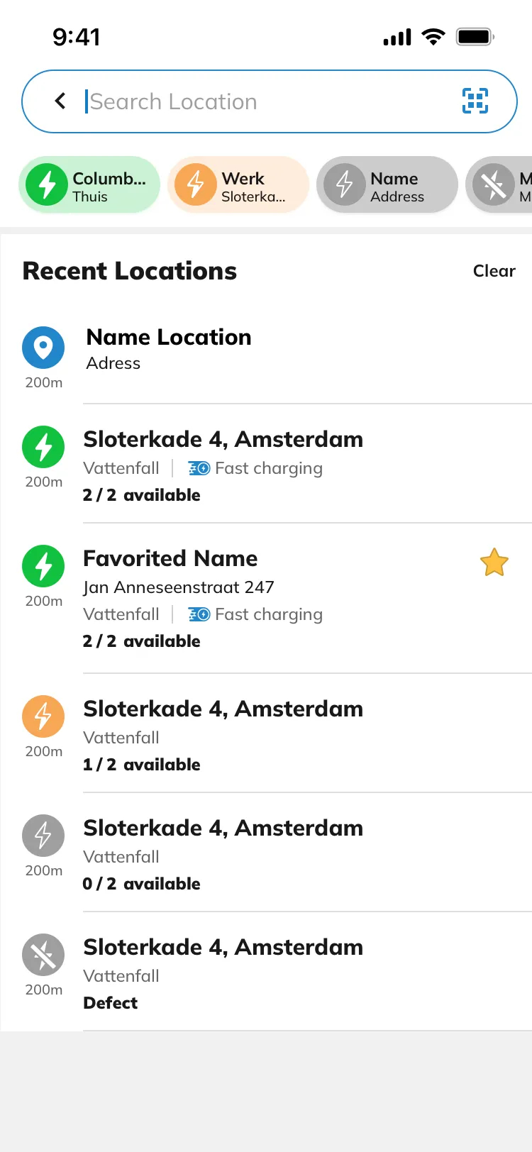 SEARCH
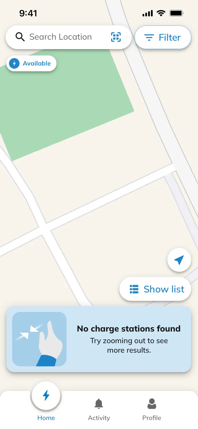 NO RESULTS
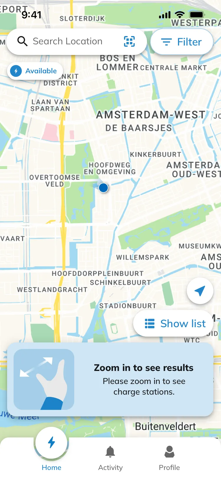 ZOOM IN
Availability is carried by one colour system across map pins, list rows and chips — green free, orange partly taken, grey occupied, crossed-out defect — so a driver in a hurry reads status before reading text. Both empty states tell the map what to do next instead of showing nothing.
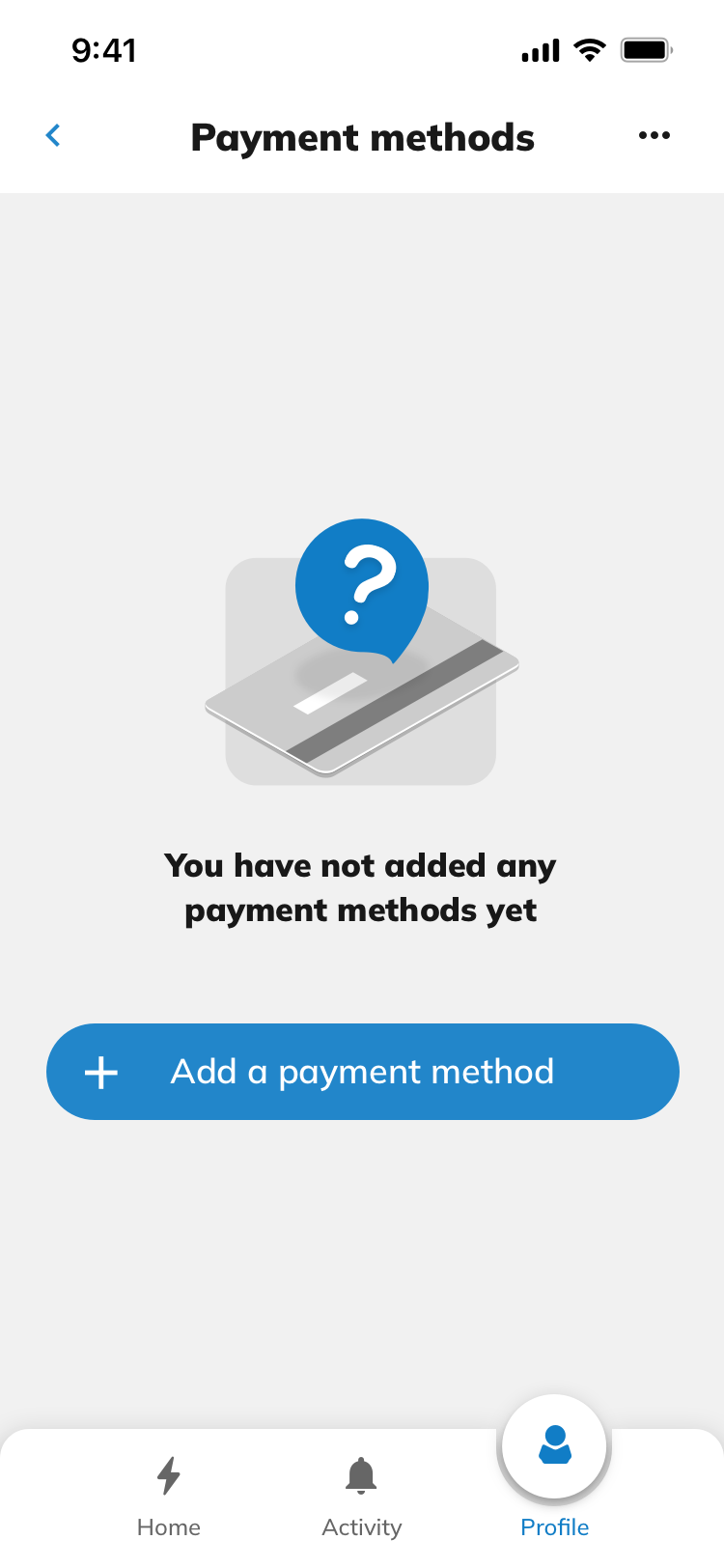 01 EMPTY
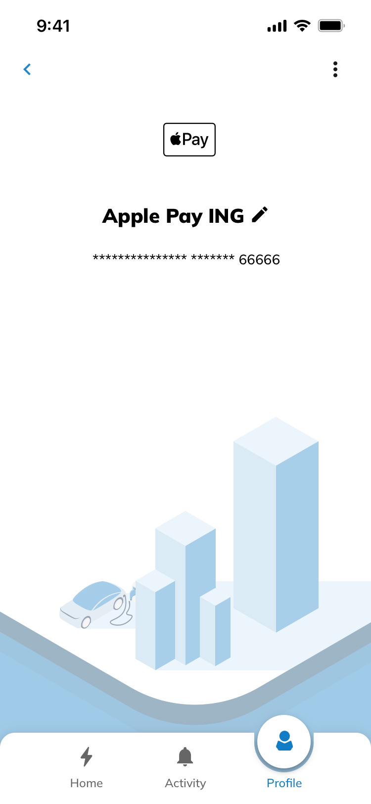 02 DETAIL
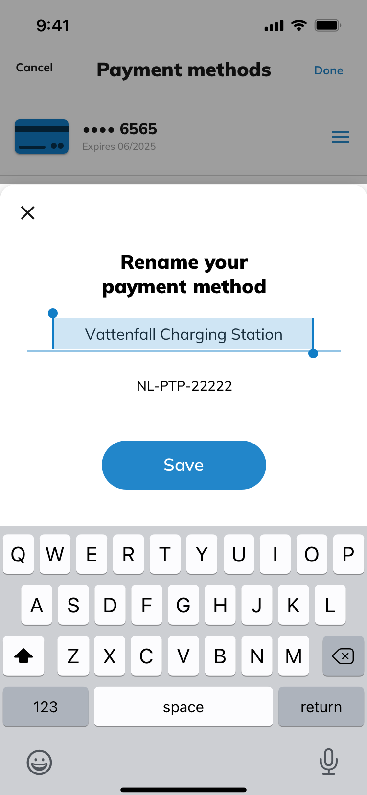 03 RENAME
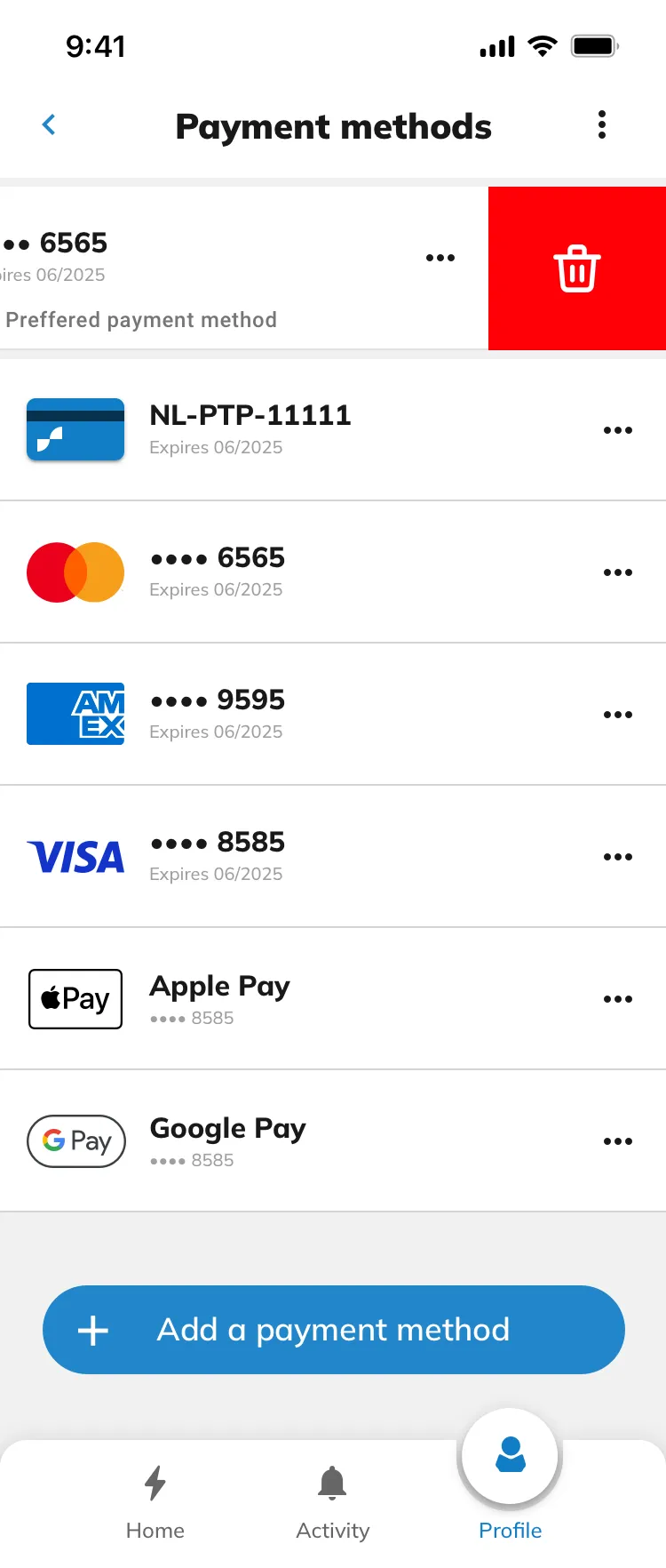 04 LIST · SWIPE TO DELETE
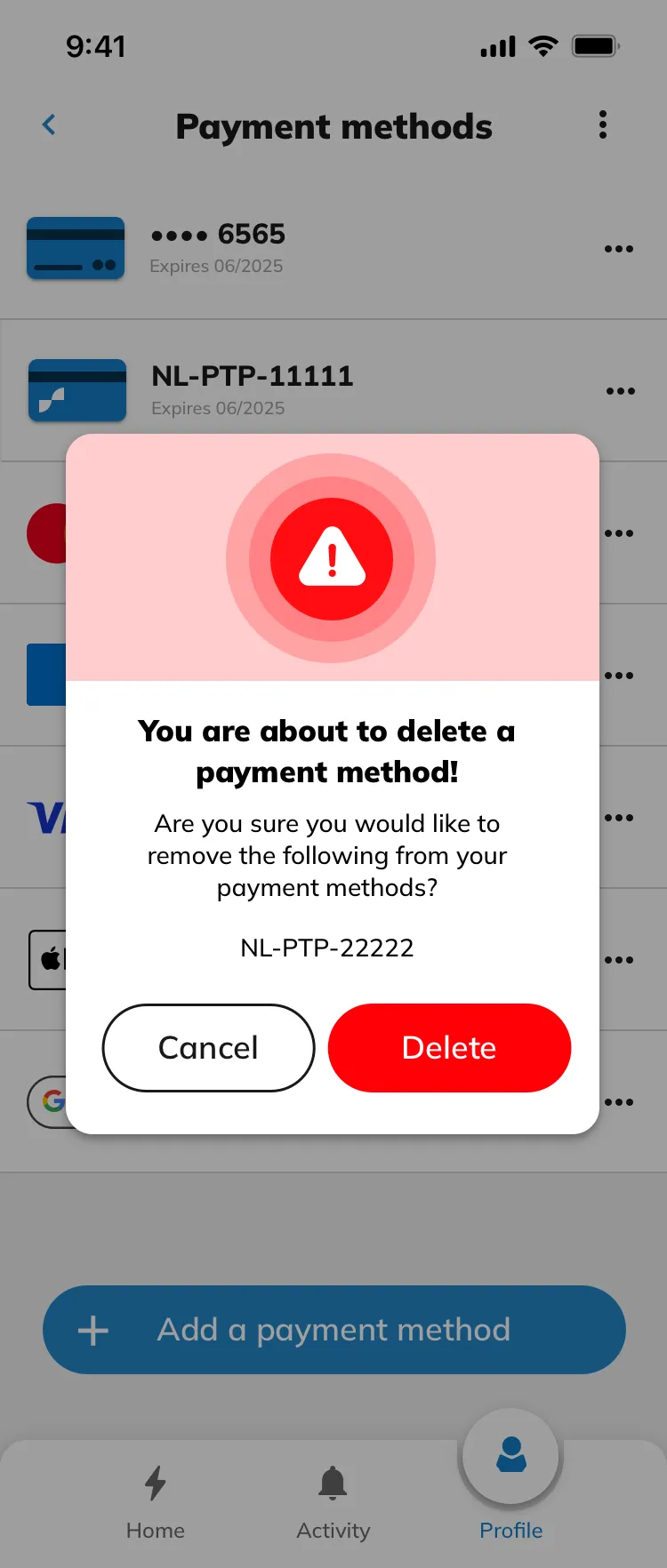 05 CONFIRM
Cards, charge passes and wallets live in one list. Every method can be renamed to something a driver recognises, and destructive actions are always confirmed with the method spelled out.
Outcomes
WHERE IT LANDEDBrand profile
Charge Assist is dedicated to transforming the EV charging experience by emphasizing user convenience and accessibility. The brand stands for innovation, reliability, and sustainability, making the shift to electric vehicles smoother for drivers. With a strong focus on delivering an exceptional user experience, Charge Assist aims to become the preferred platform for EV drivers by offering secure, user-centered, and reliable charging solutions. These core values informed every design decision, from the user interface to the integration of advanced technologies.
Looking back
Given a second run, usability sessions with drivers at public chargers would come earlier. The hardest flows — occupied stations, defect connectors, someone in a hurry with 8% battery — are exactly where desk research runs out.
Standing the design system up while the brand was still forming was the right call: the final screens were assembled almost entirely from existing tokens and components, and engineering received one source of truth at handoff.